
Dropdown
Description
The Dropdown part allows you to present to end users a dropdown menu from which to select one or multiple options. You create a dropdown menu by entering the selectable options manually, or you can create a table that contains the dropdown menu options for the system to display.
The Dropdown part allows for two primary types of dropdown configuration:
- Simple Dropdown – This results in a single answer; for example, "Which of the following items is your #1 favorite food?".
- Multi-select Dropdown – This results in one or more answers; for example, "Which of the following countries have you visited?".
Node Type: This is available in the form-part menu and can also be created using dropdown in a form-part node.
Used With: The dropdown part is available for use in projects created in using all frameworks as well as in projects without a framework.
Tips and Tricks
Reordering Options
As of v8+ you can easily reorder manually entered options in a radiolist, dropdown, or checklist by dragging the row up or down. Using your mouse, click and hold the leftmost column indicator, move it into the desired order, and release.

Creating Dropdown Menus
You can create dropdown menus using a list of manually entered choices. You can also create dropdown choices dynamically:
- From data contained in a table you create in the project/resources/data folder or from an external data source.
- From a data collection created from a data table or in an interim collection containing relevant choices based on the user’s input.
Displaying Other Text
By default, when the system displays the dropdown menu and before the user clicks on it, the system displays the first item in the list. On the Advanced tab, however, you can change what the system displays. Set the Top choice caption to "---choose from list---" or something similar and leave the top choice value blank. This works for single-selection menus only.
If you are populating the dropdown menu from a collection the system displays fields that allow you to specify captions and values independently. You can also define complex captions from multiple objects in the collection; for example, you could add a product name to a SKU or a continent to a country name.
When Not to Use Dropdowns
Dropdown menus require more "work" on the part of the user to answer a question, especially those dropdowns with a lot of choices or multi-select dropdowns. For example, users can navigate through radio lists, checklists, and text input fields using the keyboard only. If you are trying to speed up a user's ability to answer questions in your application, you may want to use dropdowns sparingly.
It is possible to string together several radio/checklist questions that narrow down the user's choices; for example, if you wanted to ask the user the countries he visited last year you could first ask the user to choose which continent he visited. You would then display a shorter dropdown menu of countries visited because you can filter by continent. You might also consider using an autocomplete text input field as a replacement for a simple dropdown with many choices.
Route on Output in Assessment Framework Applications
Use this feature to determine the user experience when answering questions. With route on output unchecked, any subsequent questions will appear on screen at the same time and the user can answer in any order. For a more structured step-by-step user experience, connect the _unanswered leg of a numeric or text input (with route on output enabled) to the STOP node (or an empty process node) to cause the UI to stop here until the question is answered. In version 8.1+, the same feature is available for radio lists, checklists, text and numeric inputs.
Sticky Editor Tabs
From v8 on, the part editor tab navigation is sticky in that whichever tab is active for the node you are inspecting/editing, when you click to another node, the same tab opens. This is helpful when you are making "mass changes", for instance adding mandatory validation to multiple nodes: select the validation tab, then as you click on each node to be edited, the validation tab automatically shows first.
Editor Fields
Basic Tab Options
| Field Name | Description/Use | Type/Options | Mandatory/Optional |
| Type (v7.4+) |
This field defaults to the specific form part you selected from the Nodes toolbox; for example, a dropdown menu. However, you can use this field to quickly change the type of form part without having to recreate answer options. If you first created your question and a checklist, for example, but realize it should be a radio list, use this field to select an alternative question type, and click save. The system transfers the key parameters into the new question type. Parameters specific to the question type (e.g. top choice for dropdown) remain in the configuration, and will be redisplayed if you convert the form part back to your original selection. Making this change may trigger some validation warnings, which you can address as necessary. WARNING: When converting a radio list with "Route on Output" to a checklist, remove the Route on Output flag prior to converting your part or remember to connect the checklist with the next node using a standard link (not one that says "default" or a specific answer option). NOTE: When switching from a checklist to dropdown, the data type stays set to collection, which results in the dropdown allowing multiple values. To force the user to select only one value from the dropdown list, change the data type to text or number based on the answer options. |
- Radiolist - Checklist - Dropdown |
Mandatory |
| HTML enabled | When this is enabled you can put HTML formatting in the Question caption, which means the system will display HTML tags in the text in the caption editor as they would appear in a browser. The editor browser provides limited HTML editing options for text formatting. You can toggle the HTML-enabled button on and off to alternate between seeing and editing tags and displaying them as they will appear. | Checkbox | Optional |
| Question | This is the question or caption the system will display next to your dropdown menu. | Text | Mandatory |
| Data object | This is the name of the data object in which the VALUE associated with the user’s choice will be stored. This will be a single object variable in the case of a simple dropdown, or a collection in the case of a multi-select dropdown. | Text | Mandatory |
| Data type | This is the category of the data object and value(s) being retrieved by user input. Select text or number for simple dropdowns, and select collection for multi-select dropdown menus. | - Text - Number - Collection |
Mandatory |
| Caption object | This is the name of the data object in which the CAPTION associated with the user’s choice will be stored. This will be a single object variable in the case of a simple dropdown, or a collection in the case of a multi-select dropdown. | Text | Optional |
| Weight | If you are using predictive diagnostics or calculating weights, this is the weighting for the question regardless of answer chosen. (Note: You may assign a weight to each answer option.) | Number | Optional |
| Submit on select | If you click this checkbox, the system will move to the next question or the next page when the user makes a selection from the dropdown menu. If your application is based on a framework the system submits the form when the user makes a dropdown menu selection and the system executes parallel and downstream steps. | Checkbox | Optional |
| Route on output | If you click this checkbox, the system will use the selected data object as the path to the next step. For example, if the dropdown menu options are "bike", "car", and "plane" and the user selects "bike", the system would then follow the path designated for "bike". This option can only be used for simple dropdowns. |
Checkbox | Optional |
| Speech command | If speech recognition is enabled, this is the recognized command the system will use to identify the dropdown component so its individual items can be specified. | Text | Optional |
| Data location | This tells the system where to look for the data that makes up your dropdown menu, and you have the following options:
|
- Manual - Numbered - Collection - Indexed collection - Table data |
Mandatory |
| Options | If your data source is manual, you enter the values and captions you want to include in the dropdown menu.
|
- Text - Number |
Mandatory |

Validation Tab Options
| Field Name | Description/Use | Type/Options | Optional/Mandatory |
| Type | This field allows you to configure a validation error to display when the condition is violated.
|
Options | Optional |
| Condition | This is only required when type=custom. See Setting Conditions (Data Validation) for more information. | Optional | |
| Message | This is the message the system displays to the user when a validation rule is violated. The system only shows the first message for the violated rule to the user. | Optional |
Style Tab Options
See the Style Tab Options article for more information about these settings.
Advanced Tab Options
| Field Name | Description/Use | Type/Options | Optional/Mandatory |
| Captions (v8.1+) |
This allows you to specify different captions based on rules. The system only displays one caption, the last caption in the table the rule determines to be true. If there is no rule the system determines to be true, the system uses the 'standard' caption. For an example, see Multi-Caption Example Project. | Text | Optional |
| Top choice caption | This is the caption of the item you would like to display at the top of the dropdown menu. Note: The system does not display this option when Processing Mode is set to use context. See below. | - Text - Number |
Optional |
| Top choice value | This is the value the system will record if the user selects the top choice caption you set for the the first item in the dropdown menu. Note: The system does not display this option when Processing Mode is set to use context. See below. | - Text - Number |
Optional |
| Default value | To pre-populate the dropdown menu with a starting value, enter the answer option here. | - Text - Number |
Optional |
| Selected text | For a multi-select dropdown menu, the data type is "collection". This field allows you to set the phrase telling users they can select one or more items from the list. | Text | Optional |
| Check all text | This field is valid only for a multi-select dropdown menu. It allows you to enter the text the system displays at the top of the multi-select dropdown menu, and the user can click the text to select all elements in the dropdown menu at once. | - Text - Number |
Optional |
| Uncheck all text | This field is valid only for a multi-select dropdown menu. It allows you to enter the text the system displays at the top of the multi-select dropdown menu, and the user can click the text to deselect all elements in the dropdown menu at once. | - Text - Number |
Optional |
| Select values on top | This field is valid only for a multi-select dropdown menu. If this checkbox is checked the system will display the selected items at the top of the dropdown menu so users can see what they have chosen. | Checkbox | Optional |
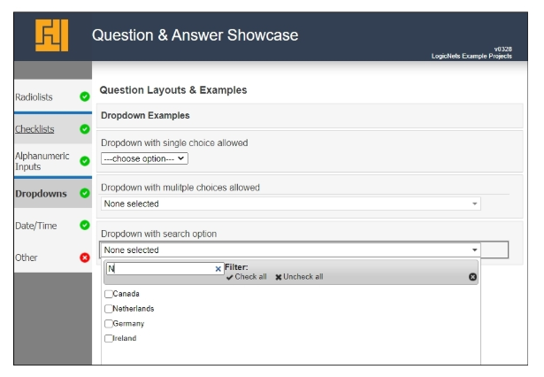
| Filtering enabled | This field is valid only for a multi-select dropdown menu with many items. It allows you to apply a text filter above the dropdown menu choices so the user can shorten the visible list with a search string. | Checkbox | Optional |
| Display selected values on new line | This field is valid only for a multi-select dropdown menu. If you check this checkbox the system displays on a separate line at the top of the dropdown menu each of the selected items so users can see what they have chosen. | Checkbox | Optional |
| None selected text | This field is valid only for a multi-select dropdown menu. This is the text the system will display at the top of a collapsed multi-select dropdown menu to indicate that none of the elements in the dropdown have been selected. When the user has selected at least one element, the system displays the value of the selected element(s) instead. | - Text - Number |
Optional |
| Processing mode (v7.4+) |
The default behavior is Always use form value, which takes the user input or on-screen value, including "not answered", and assigns it to the data object. If an earlier answer/pathway combines to set a later on-screen variable, choose Use ctx for this data object to display the context value. This value can always be overwritten by user input |
- Always use form value - Use ctx when form value empty |
Mandatory |
| Add empty top choice | This field only displays if Processing Mode is set to Use ctx when form value empty. Turn this feature on when the user needs to be able to "answer" a dropdown question with an empty response (null value) that is not part of the dropdown choice list, collection, or table of values. Leave this feature off if the user should choose from only the modeled dropdown options. |
Checkbox | Optional |
| Disable input expression (v7.4.6+) |
Use this to disable the input based on the value of another variable by entering $(...). It prevents the user from editing/changing the selected option. Otherwise, this will reflect the "Disable Input" checkbox setting in the Style tab (1 for disabled, 0 for enabled). | Yes | No | Optional |
Example
Download the How-To Guide called Q&A Showcase example project to see the different dropdown options possible.
Reply
Content aside
- 3 yrs agoLast active
- 198Views
-
4
Following