
Dbgrid (Release 7.4+)
Description
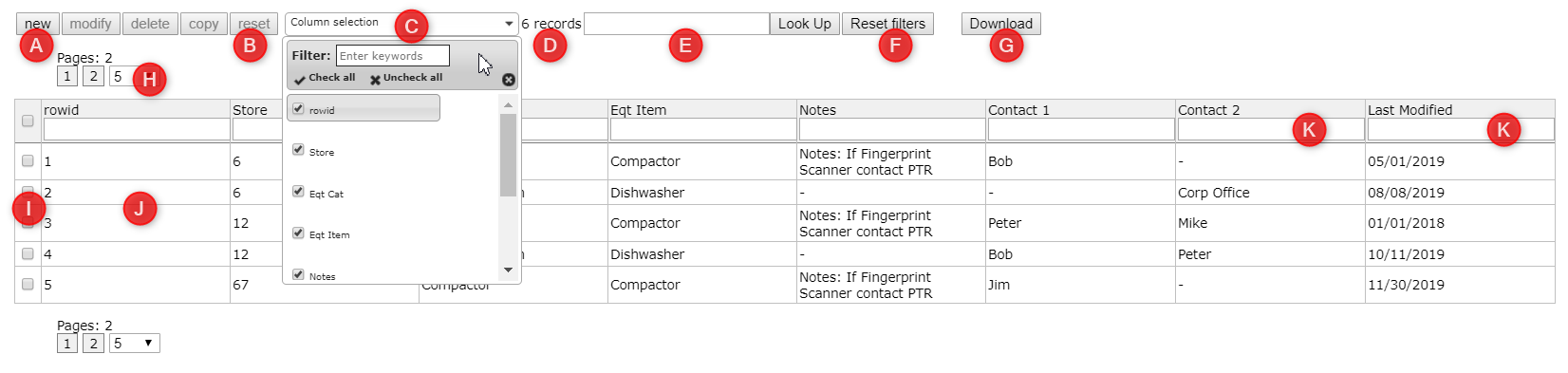
The database grid (also called dbgrid3 or db_grid3) allows you to display as a table data that is in a data table in your project. You can make this displayed table read-only or you can allow users to select from entries in the table. If a user selects and entry from the table, you can pull data from this selection for use in the session. The example grid above contains references related to the parameters described below.
Used With: You can add this part to any form or form-node type in projects without a framework and with frameworks such as the Starter App or the Reporting Frameworks. The Easy Customization Starter project available in the Designer includes a dbgrid3. This part also features heavily in reporting applications.
Note: While this part offers functionality that allows you to configure display tables in a variety of ways, LogicNets also offers a similar dbgrid part with very limited functionality for use without a framework, in very simple record display situations, and for use in form includes nodes. Click here for more information on this part.
Use
To add a database grid to a form node or form part, click the Elements tab of your node and click the Data tables button. Pull down to Display database grid and fill out the parameters based on the information in the Editor Fields table below. In LogicNets v7.4 and higher, you can also add a dbgrid form-part node in the StarterApp Framework.
Tips & Tricks
New in LNv8 is the ability to re-order the grid columns by dragging each line to its desired position.
Click+HOLD the leftmost line indicator (see screenshot below), move up or down to the desired position and release.

Editor Fields
In the editor for the db_grid3 part in version 7.4 and higher, the system provides many mandatory and optional items for displaying and working with the data it displays. These options are available in the tabs at the top of the part editor: Basic, Advanced, and Style.
Basic Tab
The basic tab is where you set up much of the functionality for your dbgrid.
Data Options
| Field Name | Description/Use | Type/ |
Optional/ Mandatory |
| Data-object | This is the name in which the system will store the table row id of the selected record if the user selects a record from the grid. | Data Object | Mandatory |
| Data source(s) | This is the name of the data table or tables you want to display as a grid to your users. Click the [...] button to select from your project's resources/data folder the table or tables you want to display. | Data Table Name | Mandatory |
| When you select a data table the following options are visible in the Columns section: | |||
| Columns | This is where you specify which columns from your data table that you want to display in your grid. If you click the ... button under "Columns", the system will place all of the columns into the grid. Note: The table selection fields allow you to use complex SQLite queries, such as count, sum, case when, and other constructions. See below for additional information. | Mandatory | |
| Column | This is the name of the column as it appears in your data table. Use the ... to select an individual column from the table. | Text | Mandatory |
| Title | This is the title the system will display for the column. If you do not enter a title the system will display the column name. | Text | Optional |
| Alias | You must use this field to store an easy name for any complex column selection when using aggregate, total rows, sort, and group functions of the grid (e.g. using CASE WHEN). Advanced Note: You can use this field to simplify the name of a column; for example, to replace the SQL SELECT partial statement below with the alias "result", which can then be used in any dbgrid overrides (see below), and is helpful in applying any specific styling to this column/cells in the grid. |
Text | Optional |
| Type | Choose from one of the dropdown options. If you leave this field empty, the data table will assume the column is text, number, or date, based on the underlying data definition. See the Advanced Data Formatting Options section below for detailed descriptions of each type and the formatting options they offer. |
- Text - Number - Date - Time - DateTime - Currency - Collection - HTML - HoursMinutes |
Optional |
| Aggregate Function | This is an aggregate function you can apply to the column of the table. To use this feature, you must specify an alias must for the aggregated columns. For example:
Advanced Note: When using aggregate functions, use the aggregate function type instead of typing the SQL expression itself in the column definition. Using the function type triggers placing the filter in the HAVING statement. Otherwise, the system places the filter in the WHERE statement, which can cause to erroneous results. |
MIN MAX COUNT AVG SUM GROUP_CONCAT |
Optional |
Selection Criteria/Filtering Options
| Field Name | Description/Use | Type/ Options |
Optional/ Mandatory |
| Selection | Clicking the ... button next to this field opens the Selection Editor, which allows you to specify rules around the data you want to display in your table. For example, if you want to use only those data entries for customers with the last name Smith, you can create a rule specifying that. If want to use a data object from a collection, you also choose that here. Selection operators vary by variable type as follows:
Advanced Note: While less commonly used, you can apply the greater than/smaller than rules for numeric fields can to text fields, as per SQL. |
Text | Optional |
| Group by | If the table you want to display contains duplicate entries, you can use this field to group them for display. For example, if you have a table that lists both state names and city names, you can group the data by the state name. You select the name of the column by which you want to group your data. | Text | Optional |
| Order by | You can use this field to tell the system in which order to display the data, by specifying one or more columns and the ascending or descending order. For example, in a table of US State names and baseball teams, you could display the names of the states alphabetically A to Z, or instead sort the list by number of baseball teams in descending order, with a second level sort on state name ascending. You select the name of the column by which you want to order your data and whether you want to order it in ascending or descending order. Note that if you check the sortable option, your users can force any single column (included or excluded here) to be sorted. The order-by settings here are applied as a secondary sort AFTER the user sort. Advanced Note: Leave the asc/desc field blank to let the system sort the column in the actual order as per the base table. This is usually in row-id or creation-date order. |
Text | Optional |
| Having | The HAVING clause in SQLite enables you to specify conditions that filter which group results appear in the results. You can enter HAVING clauses in this field and use the + buttons to add additional clauses. | Text | Optional |
| Additional filters | This field allows you to add additional SQLite statements to further filter the data the system displays in the grid. You use the + buttons to add multiple filter statements. | Text | Optional |
User Interface Options
| Field Name | Description/Use | Type/ Options |
Optional/ Mandatory |
| Paging - default limit | This sets the initial number of rows per "page". If there are more records than this default number of rows, additional page markers are shown. During runtime, the user can change the number of rows per page. | Number | Optional |
| Show id column | When you select this option the system will display the id column of the grid. (J) | Checkbox | Optional |
| Show row count | If this checkbox is checked the system will calculate the sum of the numbers in a particular column. For the system to do this, however, you must set the row type to "Number" when you define the columns to display in the grid. You do this in the Type field. (B) | Checkbox | Optional |
| Totals row caption | To have the system calculate the sum of the numbers in a particular column, you enter a caption for that information. The system will add a row to the bottom of the table if that column is defined as Type="number". Remove everything from the caption box to eliminate the row totals. If you are using aggregate functions (SUM, COUNT, etc.) as well, you must associate an alias with the aggregated columns for the system to include them. (See Advanced Tab Columns section below). You can style the totals row independently from the rest of the table using the CSS selector. You can paste the sample styling below into a custom CSS file to provide additional padding, borders, and stand-out font adjustments for the totals row. You apply these to columns using the CSS TD selector for each column.  |
Text | Optional |
| Selectable | Click this checkbox if you want to allow users to select a row from the table. Users must be able to select a row for them to update, edit, or remove entries. | Checkbox | Optional |
| Submit on select | If this checkbox is checked, the system submits the form when the user selects a row. | Checkbox | Optional |
| Submit on double click | If this checkbox is checked, the system submits the form when the user double-clicks a row. To use this feature you must also check the checkbox next to 'Submit on select'. | Checkbox | Optional |
| Add | If this checkbox is checked, the system displays a button at the top of the grid that allows users to add new records to the grid. (A) | Checkbox | Optional |
| Modify | If this checkbox is checked, the system displays a button at the top of the grid that allows users to modify existing records in the grid. (A) | Checkbox | Optional |
| Delete | If this checkbox is checked, the system displays a button at the top of the grid that allows users to delete records from the grid. (A) | Checkbox | Optional |
| Copy | If this checkbox is checked, the system displays a button at the top of the grid that allows users to copy an existing record and paste it as a new record in the grid. (A) | Checkbox | Optional |
| Show grid options (top bar) | If this checkbox is checked, the system displays the action buttons (Add, Modify, Delete, Copy) at the top of the grid. If it is not checked, users will not see the action buttons.(A) | Checkbox | Optional |
| Allow export | If you click this checkbox the system also displays an additional field called Export-file name, in which you enter the name under which the system will create and download a csv file when the user clicks the Export button the system displays on the top-right of your grid. If the user clicks the export button the system creates a csv export file of the complete contents of the table, assigns it the name you specified, and downloads it to the users computer. (G) | Checkbox | Optional |
| Text filter | If you click the checkbox next to this option, the system will display a text filter box at the top-right of your grid. Users can enter terms in this field to search for particular terms in the grid. (E) | Checkbox | Optional |
| Show reset filter button | If you click the checkbox next to this option, the system will display a Reset filters button next to the text filter box. This lets the user remove any filters they applied and see the entire grid. (F) | Checkbox | Optional |
| Reset filter on reload | The system stores free-text and column filters in the session context by default. However, if you switch to another grid the system would apply the same filters. Selecting this option ensures the system deletes the filters when presenting the grid but keeps them as long as the system does not step forward. | Checkbox | Optional |
| Show check boxes | If you click the checkbox next to this option, the system adds a column at the front of your grid and inserts a checkbox for each row. This allows users to select multiple rows or one particular row using the checkbox. It also puts a checkbox in the column heading so users can select all rows. (I) | Checkbox | Optional |
| Submit on check | If you select Show check boxes, the system shows you this option. If you click the checkbox next to this option, the system passes the status of the checkbox to the server but does not submit the form. | Checkbox | Optional |
| Reset checkbox on loading | If you select Show check boxes and then click the checkbox next to this option, the system will clear any user-selected checkboxes in the grid when the page is refreshed or reloaded. | Checkbox | Optional |
| Data-object for checked rows | If you select Show check boxes, this field is where you enter the name of the collection that holds the selections your user makes from the grid. | Data Object | Optional |
| Sortable | Clicking this checkbox enables users to sort each column in the grid by clicking the header row. | Checkbox | Optional |
| Filter per column | Selecting this option allows users to filter the grid by each column. The system displays a filter dropdown menu at the top of each column. | Checkbox | Optional |
| Filter with textbox | If you have selected 'Filter per column', you can also click this option and the system will display a filter text field at the top of each column. (K) See the Advanced Data Formatting Options section below for more information about the search possibilities for numbers, currency, and date fields. | Checkbox | Optional |
| Show/Hide columns | If you select this option the system will display a dropdown menu at the top of your grid that allows users to select columns to hide. (C) | Checkbox | Optional |
Advanced Tab
The Advanced tab gives you tools to control data formatting, user interface, and programming options for your table.
Data Formatting Options
The system allows you to control the runtime format of your columns, depending on the type of data in that column. The following types and related type-parameters are available when you select the columns to display in your table. For more information about some of the formatting options, see the Advanced Data Formatting Options section below.
| Field Name | Description/Use | Type/ Options |
Optional/ Mandatory |
| Columns | This section contains the list of columns you selected to display in your table. In this section you can add additional formatting parameters based on the type of data in that column. | Optional | |
| Column | This is the name of the column the system will display in your table. | Text | Optional |
| Time format string | This is where you enter additional time formatting options. See Formatting Dates for more information. | a | Optional |
| Date format string | This is where you enter additional date formatting options. See Formatting Dates for more information. | Text | Optional |
| Datetime offset | This is where you enter date/time offset options. | Text | Optional |
| Currency symbol | This field is where you enter the required symbol or text (e.g. GBP) as a prefix to the values displayed in the column. | Text | Optional |
| Separator (for collection items) | In this field you enter the separator type you want to display between the items in a collection; for example, a comma or semicolon. | Text | Optional |
| Empty on Top | If you set this option to Yes, the system will sort the column so rows with a NULL value appear at the top. | Yes | No | Optional |
| Max Size | This controls the size of the column. It is the number of characters the system displays in the field before displaying ... (number). | a | Optional |
[see Advanced Use of SELECT Statements below]
User Interface Options
| Field Name | Description/Use | Type/ Options |
Optional/ Mandatory |
| Default column ID | Here you can specify another column to be used as the primary key/id for the table. If this is blank the table assumes its own id is the key. | Text | Optional |
| Readonly column name | When you enter the name of a column in this field the system displays this column as read-only. To make additional columns read-only, add the following to the target column(s) after the column definition (via the code tab - Expert Only)
|
Text | Optional |
| Readonly column hide | If you have assigned a read-only column and you check this checkbox, the system will not show the read-only column. | Checkbox | Optional |
| Allow edit id column | Selecting this option allows users to edit the value in the id column. NOTE: This is the value by which the system identifies the row in the table, and it must be unique. The user will see an error message if they try to change the row id to one that already exists. | Checkbox | Optional |
| Show checkbox for NULL values | When a user is editing a row, the system displays text input boxes. By default, the system does not differentiate between an empty value and a NULL value--an empty field is treated as a NULL value. If the checkbox next to this option is checked, the user will see a checkbox next to the text input field.
|
Checkbox | Optional |
| Empty cell text | Empty cells show with '-' by default and is overwritten by an entry here (e.g. n/a, 0 or remove the '-' to show an empty cell) | Text | Optional |
| Column Filter Wildcard (Rel 8.0) |
Specify a wildcard for use in the column filters. Using a custom wildcard overrides the default behavior and permits search of strings starting or ending with the user entry. For example, a custom wildcard of '%' will allow:
Default setting (no wildcard specified in the part editor) performs a basic string search (%ABC%) anywhere in the column (e.g. enter ABC in the filter to find 'ABCDE' and 'anythingABC') |
Text | Optional |
| Custom buttons | With this option you can add custom buttons into your options bar (top bar) (B above). You enter the following options for each button. Their function and setting options are described below.
|
Various | Optional |
| Show loading bar | If you click the checkbox for this option the system will display a "loading" bar when the grid is being loaded or is processing data. | Checkbox | Optional |
| Do not lazy load | By default the system presents a data grid is presented in 2 steps: (1) the system prints to the page the header and buttons; (2) the system prints the table rows. Displaying the table in two steps means the user may see a slight delay. If the user clicks the checkbox next to this options the system loads the whole grid in one step. This prevents flickering as the table is being created but can cause slower loading. | Checkbox | Optional |
| View state data object | The system stores the view-state (filters and sorting states) in the session context. Specify a data object here and you can model overrides to the default behavior, including specifying different views based on different roles (when user roles have been specified). Override fields include
|
Text | Optional |
Programming Options
| Field Name | Description/Use | Type/ Options |
Optional/ Mandatory |
| Select callback (js) | This field allows you to specify the piece of JavaScript the system will execute when a user selects a record. The system does not pass any parameters. | Text | Optional |
| Submit callback (js) | This field allows you to specify the piece of JavaScript the system executes when the user double-clicked and Submit on double click has been enabled. The system will not execute the JavaScript if the user clicks one time. | Text | Optional |
| On Loaded callback (js) | This is the JavaScript function the system calls when the grid is drawn completely. | Text | Optional |
Style Tab
The style tab is where you can set css styling options.
| Field Name | Description/Use | Type/ Options |
Optional/ Mandatory |
| Table CSS class | Enter a name here and the grid will have a table class of "datamodel [your_name]", which you can use to pick up CSS declarations to style the table (e.g. background, borders). | Text | Optional |
| Header CSS class | Enter a name here and the grid will have a thead class of "[your_name]" which you can use to pick up CSS declarations to style the header row (e.g. background color, font size). | Text | Optional |
| Save button CSS class | You can control the way the save button looks by entering the name of a CSS class in this field and then defining the class in the CSS file for your project. | Text | Optional |
| Cancel button CSS class | You can control the way the cancel button looks by entering the name of a CSS class in this field and then defining the class in the CSS file for your project. | Text | Optional |
| Option buttons CSS class | You can control the way any activated option button looks (Add, Modify, Copy, Delete) by entering the name of a CS class in this field and then defining the class in the CSS file for your project. | Text | Optional |
Advanced Data Formatting Options
On the Basic tab you select a table to display, and for each column the system will display you can set the data Type. Based on the type of data you specify the system will default to the format set in the System Configuration package Localization Settings (click for article). This part offers some additional formatting and display parameters that can be used to override the system defaults as necessary. The following table provides additional information about each one.
Note: Some formatting options are only available in this part by entering them on the code tab. Those have been identified below with [CODE EDIT].
| Column Type | Additional Parameters | Description of Runtime Effects |
| text (or empty) | The system prints the value from the data table without any conversion. | |
| number | round_truncate, |
The system prints the input as value. You can also set the following formatting options: round_truncate [CODE EDIT]
round [CODE EDIT] decimal_separator var_format [CODE EDIT] brackets_around_neg_numbers [CODE EDIT]
Filtering If the column is set to number or currency:
You can stack conditions by separating each one with a comma. For example, if you enter " >=100, <=200" the system returns those records where the column value is between 100 and 200. |
| date, time, date_time | date_format + _str, _str_month_year, _str_year, time_format_str, date_separator, strip_zeros |
The system prints the value as Date, Time, or Date/Time values. See Formatting Dates for more information. When using Filter with Textbox, you can limit records with partial date strings:
|
| currency | symbol, symbol_location, decimal_separator, thousands_separator |
If you select currency as the type, the system prints the as currency with 2 decimals. You set the currency symbol on the Advanced tab in the table under Data. See the section above on numbers information on using Filter with Textbox with currency columns. The system highlights invalid values with a warning icon and tooltip as shown below. You can remove or change the icon using CSS if your specific use case does not need to show these.  symbol
_location [CODE EDIT]
decimal_separator [CODE EDIT]
thousands_separator [CODE EDIT]
|
| html | With this column type, the system does not remove the HTML encoding around the URL. This allows you to store URLs such as below to show the link as clickable on screen at runtime. Advanced Note: Depending on how the information is stored in the table, it may be necessary to prevent stripping of HTML, in which case there is an option to configure the column with no_strip_html = 1 | |
| click | action = - action - click - popup_parts display |
This setting allows users to click on the db_grid3 cell and associates that click with one of two possible actions: 'download' and 'popup'. If you activate the 'click' type the system adds an onclick event handler that calls the function called db_grid3.cell_selected. This in turn performs the configured part action in the backend. Popup [CODE EDIT] The download action is a little more complicated, as it is intended to download binary/file data from a separate database. When a user clicks on a call with the download action enabled, the part action uses the selected cell value as a key to retrieve data from the 'data_storage' database. This key has been previously obtained by storing data in the 'data_storage' database using the data_storage library. The configuration looks like this: |
| hoursMinutes | The system prints the value (in minutes) in the hh:mm format. |

Advanced Use of SELECT Statements
When choosing columns to show from your data table, it is possible to build more complex select statements using SQLite syntax (or other if using another database such as MySQL). Examples that work with the default SQLite databases include:
- use of aggregate functions as described above
- use of "case when" constructions to transform one value set to an alternative (see example below)
- use of || to join two strings (e.g. "USD $"||$(price)
- use of substr to extract partial strings (e.g. select substr(inputdate, 7, 4) as year will select 2020 from the date 06/12/2020)
- use of printf to customize number format (e.g. currency with no decimal places can be shown with select "$" || printf ("%,d",[price])
- use of ROW_NUMBER to calculate a ranking (e.g. ROW_NUMBER () OVER (ORDER BY sum(TABLE_NAME.column_name) desc) will calculate and show the ranking by subtotal of the specified column name, in descending order
For example, the following statement displays the sum of active hazard cases completed before a particular cutoff date for a particular branch (location) and created in 2018.
(Rel v8) Under the Advanced Tab Data section, the following advanced record selection options are available.
| Field Name | Description/Use | Type/ |
Optional/ Mandatory |
| custom WHERE clause | For more sophisticated WHERE clauses that are not supported by the selection editor in the dbgrid part, use this field in place to write a custom where clause, starting with the first parameter. [WHERE is not required] | Text | Optional |
| custom FROM clause | For more sophisticated FROM clauses that are not supported by the table editor in the dbgrid part, use this field in place to write a custom from clause, starting with the first table. [FROM is not required].
|
Text | Optinoal |
For further information on SQLite SELECT statements, refer to http://www.sqlitetutorial.net/; however, be aware that db_grids3 does not support all syntax.
Additional Information
The Formatting Dates article provides additional information that might be helpful if you want to fully customize your data formatting in the data table.
Examples
You can download a simple dbgrid example project here. This shows a grid with text fields, and highlights the ability to select and retrieve data from a specific record. Follow this article to receive email notification updates and future example projects.
The Advanced Number Formatting Example project showcases the ability to adjust specific number column formatting such as rounding, truncation, thousand separator, etc. as described in the Advanced Formatting Options section above.
Reply
Content aside
-
1
Likes
- 2 yrs agoLast active
- 241Views
-
3
Following