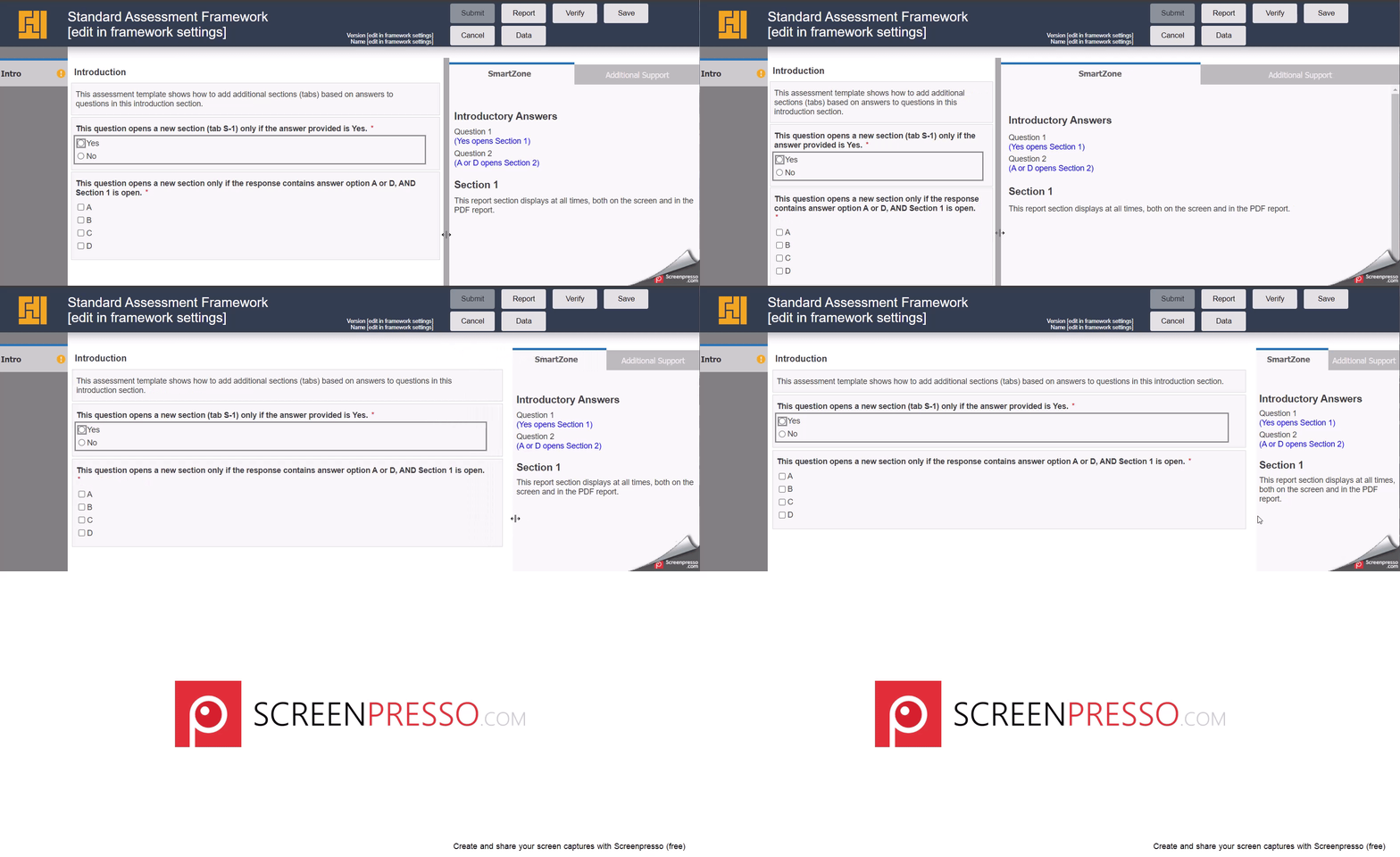
Assessment Framework Template - Adjustable Widths

In the LogicNets Assessment Framework Standard Template, we have added a feature that allows each user to customize the width of the two main panels containing the Q&A (observation panel) and Reports (report panel) during runtime.
The user can click on the divider and slide left or right to the desired width for that session. On resuming the session later, the original widths are reinstated. Below are instructions to do the following:
- remove the sliding bar feature completely (if not required)
- adjust the default/starting section widths
Remove the Sliding Bar Feature
In order to remove this feature, two files should be removed from the project:
- in the /resources/layout/js folder delete the resizer.js file
- in the /resources/layout/css folder delete the resizer.css file.
Don't forget to republish/reinstall for these changes to take effect for end users.
Adjust the Default/Starting Section Widths
The widths for section3 (observation panel) and section 4 (report panel) are set on the Cascading Style Sheet (CSS) for the framework but can be overridden at the project level by the Designer User as follows.
- (if not already present) add a custom CSS stylesheet by navigating to the /resources/layout/css folder and click NEW
- add the following CSS
div#section3 {width: X%;}

div#section4 {width: Y%;}
X and Y should sum to 100% generally (unless additional layout changes are being made).
Recommendations:
For applications where the questions and/or answer responses are very descriptive, we recommend setting X = 70% and Y = 30%.
For applications with shorter Q&A or where Help references are extensive and/or include images, we recommend setting X = 55% and Y = 45%.
Try out different values and experiment to find the best balance for the content in your application.
Reply
Content aside
- 1 yr agoLast active
- 15Views
-
1
Following
